Popular Tags
No tags found in this context
Community curated code
 github.com
shadcn-ui offers customizable, accessible components for React, enhancing UI development with open-source flexibility.
 github.com
Base UI offers unstyled components for accessible web app development, ensuring flexibility and compliance with accessibility standards.
 beam.jakubantalik.com
Border Beam is a customizable animated border component for React, enhancing UI aesthetics with ease of integration.
 dsikeres1.github.io
A customizable date and range picker for React with full accessibility and TypeScript support.
github.com
Ant Design is a comprehensive UI design language and React library for building high-quality web applications.
github.com
Material UI is a React component library implementing Google's Material Design, suitable for building responsive user interfaces.
github.com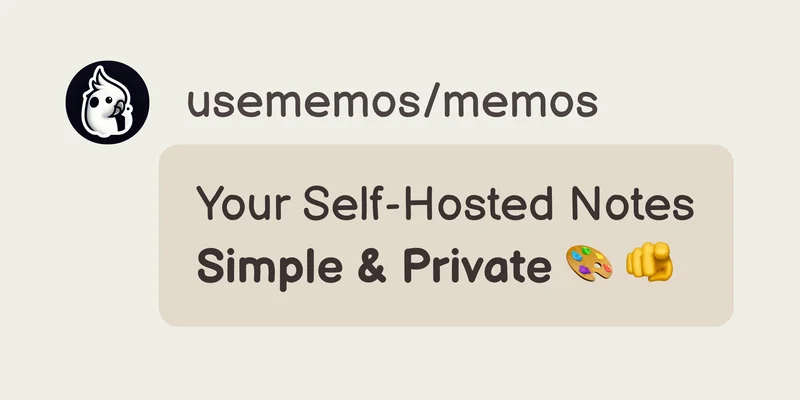
Memos is a lightweight, self-hosted note-taking tool that prioritizes data ownership and simplicity.
github.com
Storybook is a tool for building, documenting, and testing UI components in isolation, widely adopted by developers for its versatility.
github.com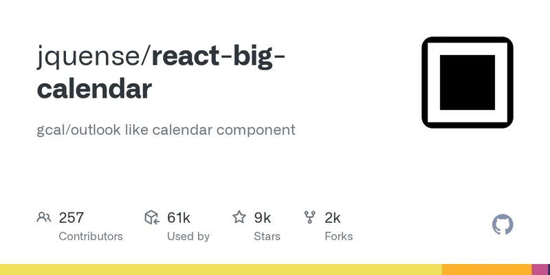
A customizable calendar component for React with localization and styling options.
github.com
React Bits offers a library of customizable animated components for React, enhancing web development efficiency.