loom/composable
 github.com
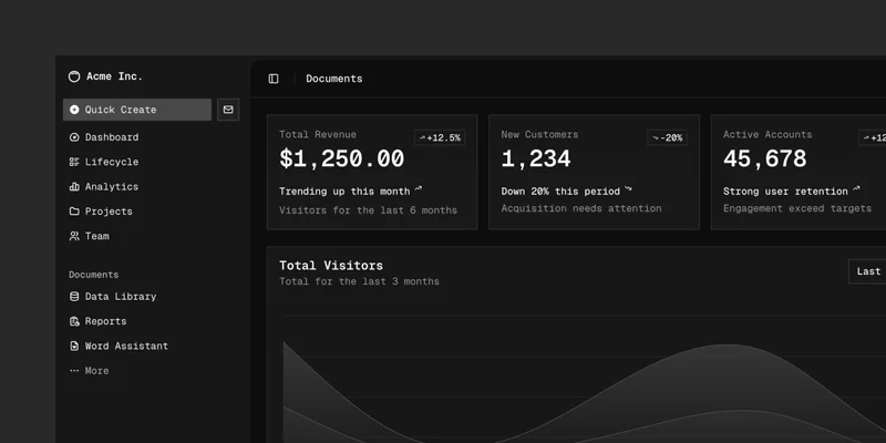
A set of beautifully-designed, accessible components and a code distribution platform. Works with your favorite frameworks. Open Source. Open Code. - shadcn-ui/ui
 flowkit-ui.vzkiss.com
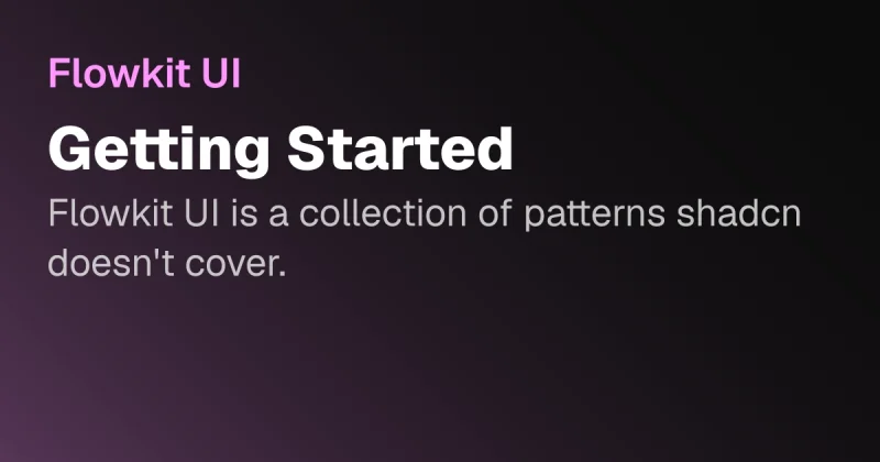
Patterns teams rebuild on every project - built once, reusable everywhere. Each one targets a concrete problem. Built on shadcn/ui and Base UI.
 typedora-ui.netlify.app
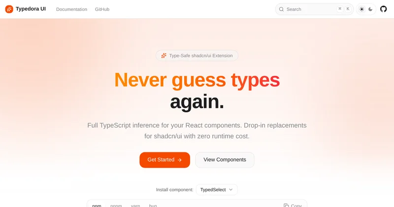
Type-safe React components with full TypeScript inference. Drop-in replacements for shadcn/ui with zero runtime cost.
 onboarding-tour.vercel.app
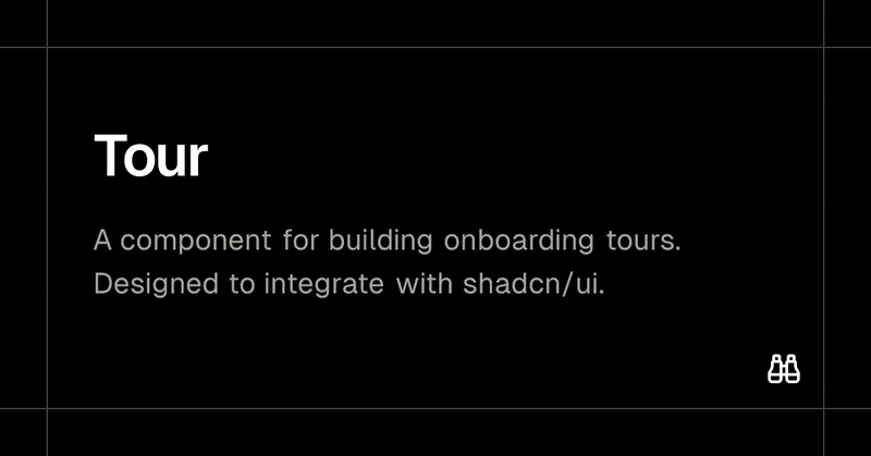
A component for building onboarding tours. Designed to integrate with shadcn/ui.
 shadcncraft.com
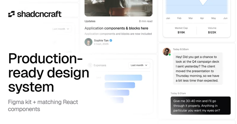
Ship faster with a production-ready shadcn/ui design system. Get a fully matched Figma kit, React components, and hundreds of UI blocks built for real products.
 shadcnui-blocks.com
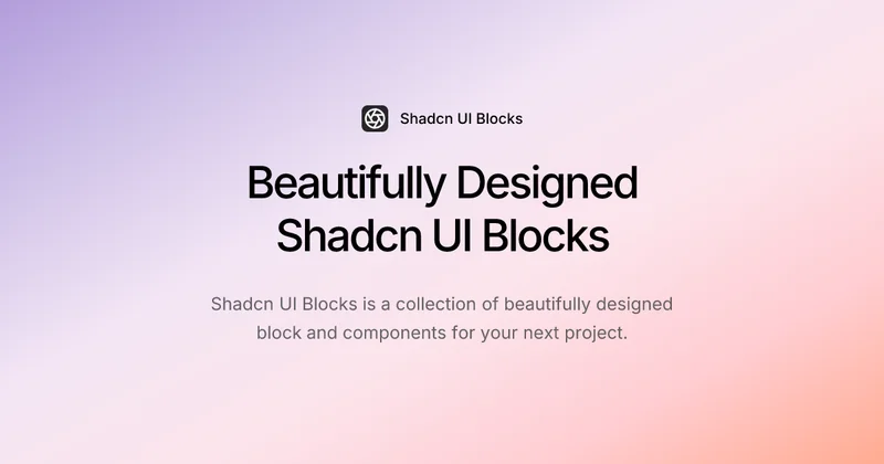
Explore a curated collection of customized Shadcn UI blocks and components. Preview, customize, and copy ready-to-use code snippets to streamline your web development workflow. Perfect for creating responsive, high-quality Shadcn UI designs with ease.
Accessible, Customizable, Rich Text Editor. Made with Lexical and Shadcn/UI. Open Source. Open Code.
 shadcnstore.com
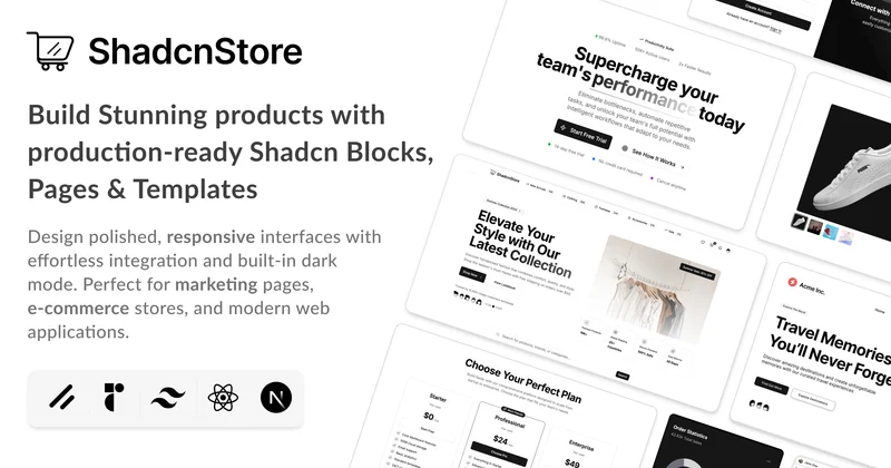
Build faster with production-ready Shadcn UI blocks and components. Copy-paste React components built with Tailwind CSS. Perfect for Next.js, Vite, and modern web applications. Start building beautiful interfaces today.
 shadcnblocks.com
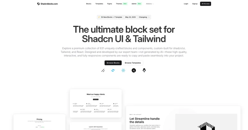
Discover hundreds of extra shadcn/ui blocks and Shadcn UI components. Shadcnblocks is a premium component library built with Shadcn UI, React & Tailwind.
 satoriui.site
A comprehensive suite of high-fidelity, interactive, accessible and extensible components to use with shadcn/ui.