craft/ui-design
 ui.eindev.ir
Open-source liquid glass React components for Next.js. Shadcn-compatible, accessible, and built for modern apps.
 efferd.com
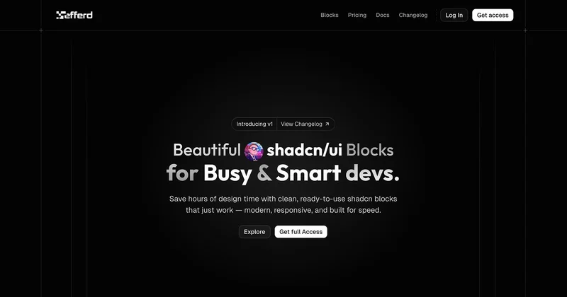
Save hours of design time with clean, ready-to-use shadcn blocks that just work — modern, responsive, and built for speed.
 ui.doras.to
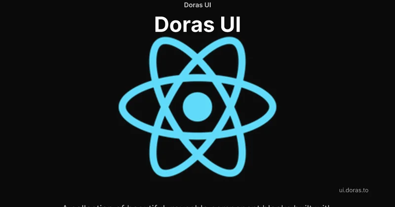
Discover Doras UI - A modern, accessible component library for React. Copy, paste, and customize beautiful UI blocks for your next project. Built with TypeScript and Tailwind CSS.
 diceui.com
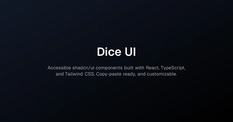
Accessible shadcn/ui components built with React, TypeScript, and Tailwind CSS. Copy-paste ready, and customizable.
 cult-ui.com
Open-source Shadcn UI components, animated blocks, and full templates you can copy-paste into any TypeScript/Next.js project.
 creative-tim.com
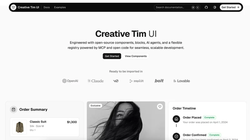
A collection of open-source UI Components, Blocks & AI Agents by Creative Tim on top of shadcn/ui. Integrate them in v0, Lovable, Claude, or your application.
 cardcn.dev
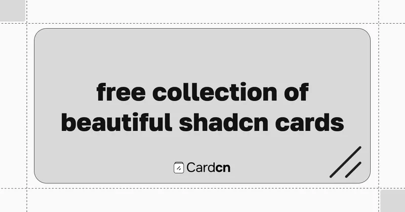
Explore a collection of awesome Shadcn Card components built with React and Tailwind CSS.
 bundui.io
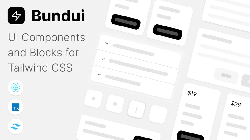
Tailwind is a carefully curated collection of 200+ handcrafted UI components built with CSS, React, and shadcn/ui.
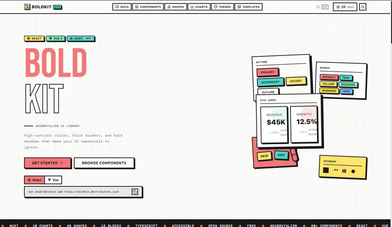
Free neubrutalism component library for React and Vue 3 with 55+ UI components, 15 section blocks, 7 templates, 54 animated SVG shapes, and 14 chart types. Built on shadcn/ui with thick borders, hard shadows, and bold colors. Install via CLI.
 basecn.dev
Beautifully crafted shadcn/ui components powered by Base UI, providing a solid foundation to build modern and elegant interfaces with speed.