craft/production-ready
 mui.com
Material UI is an open-source React component library that implements Google’s Material Design. It’s comprehensive and can be used in production out of the box.
 tailgrids.com
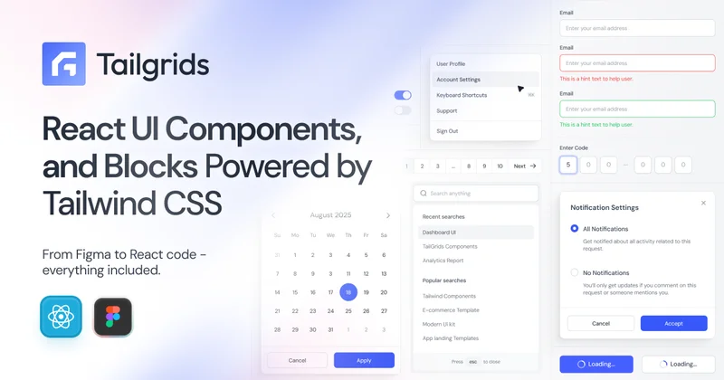
Tailgrids UI is an open-source React component library built with Tailwind CSS. Build production-ready apps faster with reusable components, UI blocks, templates, CLI tooling, theming, and a Figma design system.
 shadcncraft.com
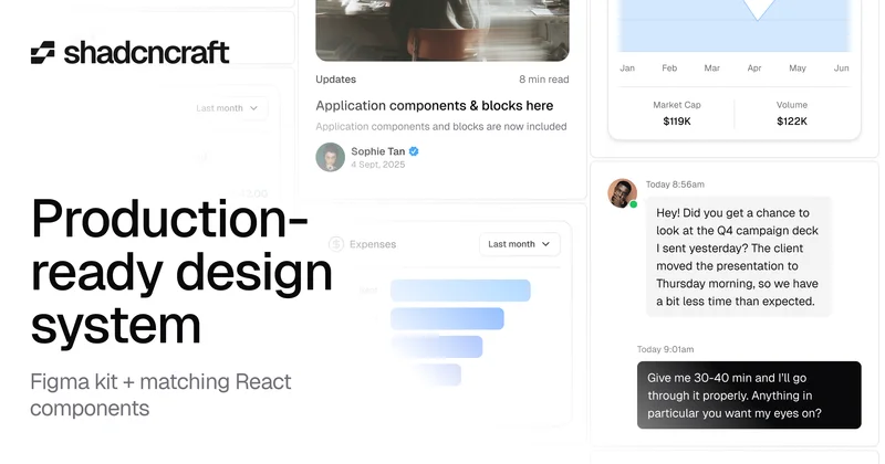
Ship faster with a production-ready shadcn/ui design system. Get a fully matched Figma kit, React components, and hundreds of UI blocks built for real products.
 shadcnstore.com
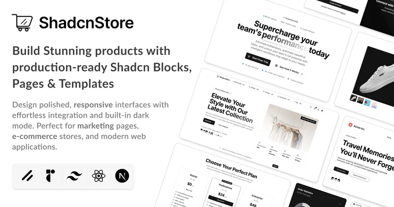
Build faster with production-ready Shadcn UI blocks and components. Copy-paste React components built with Tailwind CSS. Perfect for Next.js, Vite, and modern web applications. Start building beautiful interfaces today.
 nessra-ui.vercel.app
A beautiful component library built with Radix UI and Tailwind CSS.
 bundui.io
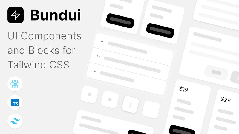
Tailwind is a carefully curated collection of 200+ handcrafted UI components built with CSS, React, and shadcn/ui.
 ui.aevr.space
A collection of beautiful, accessible, and production-ready components built on top of shadcn/ui. Get started in seconds.
 shadcn.io
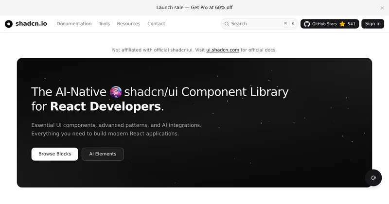
Complete shadcn/ui registry and platform with 500+ free React components, powerful theme generator, and customizable blocks. Copy-paste ready components built with Tailwind CSS, MIT licensed for modern web applications.