craft/ui-design
 storybook.js.org
Storybook is a frontend workshop for building UI components and pages in isolation. Thousands of teams use it for UI development, testing, and documentation. It’s open source and free.
 figma.com
Figma is the leading collaborative design platform for building meaningful products. Design, prototype, and build products faster—while gathering feedback all in one place.
 flowkit-ui.vzkiss.com
Patterns teams rebuild on every project - built once, reusable everywhere. Each one targets a concrete problem. Built on shadcn/ui and Base UI.
 tailgrids.com
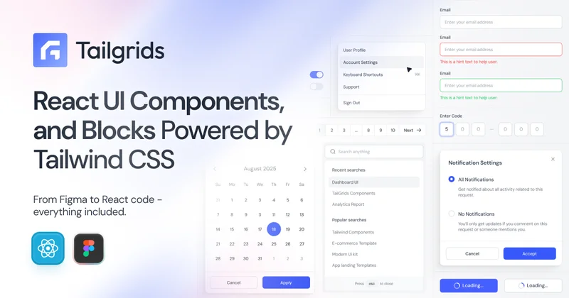
Tailgrids UI is an open-source React component library built with Tailwind CSS. Build production-ready apps faster with reusable components, UI blocks, templates, CLI tooling, theming, and a Figma design system.
Shadcn components used in service of functional clarity.
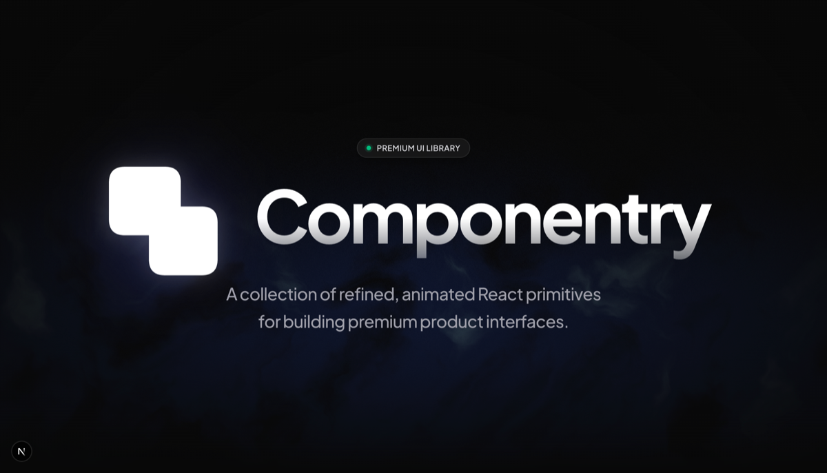 componentry.fun
Free, open-source React UI components. Beautiful, animated, copy-paste components built with Tailwind CSS, TypeScript & Framer Motion by Harsh Jadhav.
 emerald-ui.com
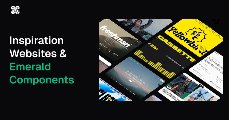
A modern UI design inspiration websites and collection of 46+ components free and open source built with Next.js, React, Tailwind CSS, GSAP, and Motion.’, revalidateTime: 3600
 pixelactui.com
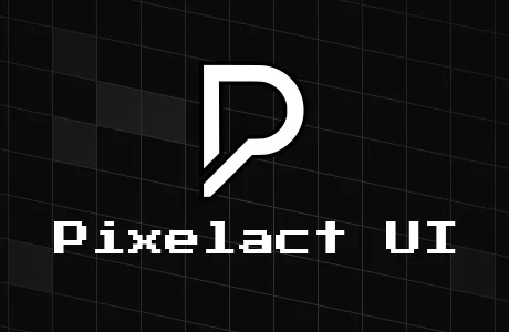
A modern pixel art styled React component library built on shadcn/ui. Open source, customizable, and perfect for retro-themed applications.
 sona-ui.vercel.app
A modern UI component library built with React and TailwindCSS to help you build beautiful and accessible web applications faster.
 fab-ui.com
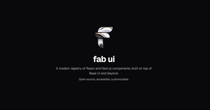
Beautiful UI components built with Base UI and Tailwind CSS