craft/design-system
 launchuicomponents.com
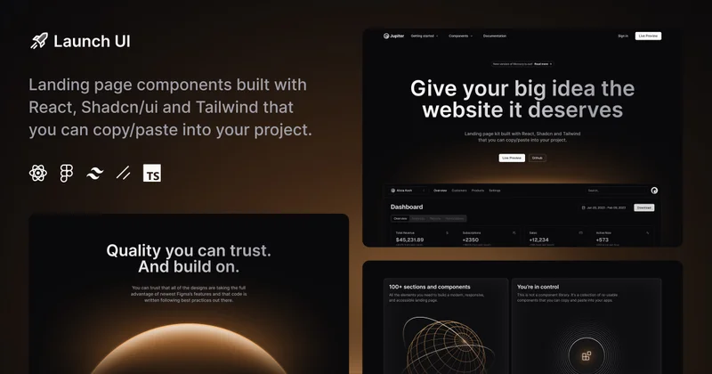
Carefully crafted components and templates built with React, Shadcn/ui and Tailwind that will help your product stand out from the crowd.
 kanpeki.vercel.app
A set of perfect-designed components built on top of React Aria and Motion.
Ready-to-use foundation components/blocks built on top of shadcn/ui.
 glass-ui.crenspire.com
A modern, glassmorphic component library inspired by Apple’s design language
 ui.eindev.ir
Open-source liquid glass React components for Next.js. Shadcn-compatible, accessible, and built for modern apps.
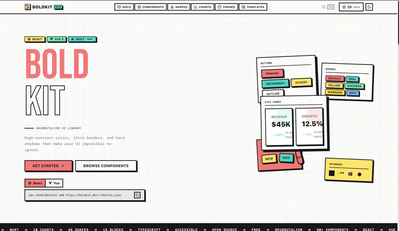
Free neubrutalism component library for React and Vue 3 with 55+ UI components, 15 section blocks, 7 templates, 54 animated SVG shapes, and 14 chart types. Built on shadcn/ui with thick borders, hard shadows, and bold colors. Install via CLI.
 ui.aevr.space
A collection of beautiful, accessible, and production-ready components built on top of shadcn/ui. Get started in seconds.
 abui.io
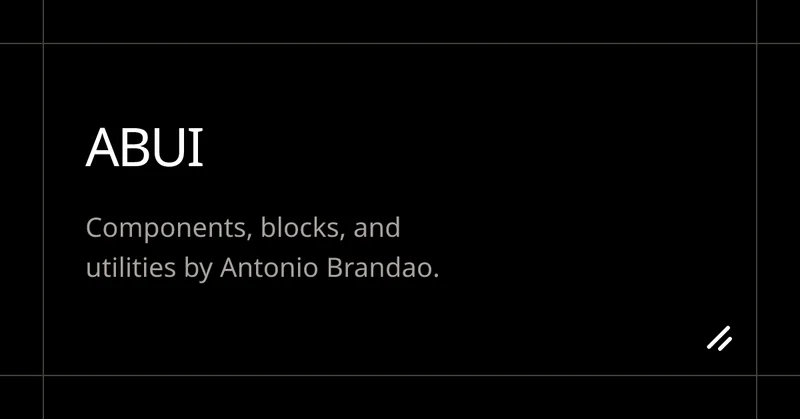
Components, blocks, and utilities by Antonio Brandao.
 ui.8starlabs.com
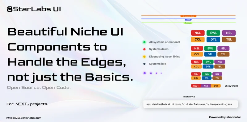
Component library designed for developers who want niche, high-utility UI elements that you won’t find in standard libraries.
 github.com
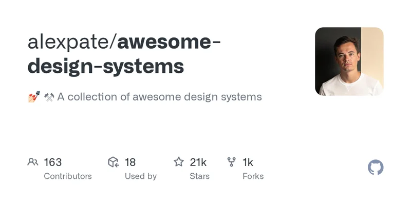
💅🏻 ⚒ A collection of awesome design systems. Contribute to alexpate/awesome-design-systems development by creating an account on GitHub.