Popular Tags
No tags found in this context
What the community is discovering in design system
 storybook.js.org
Storybook is an open-source tool for building and testing UI components in isolation, enhancing frontend development workflows.
 flowkit-ui.vzkiss.com
Flowkit UI offers reusable UI components for React, enhancing accessibility and efficiency in design patterns.
 wds-shadcn-registry.netlify.app
A collection of customizable and accessible components for building your own UI library with Shadcn.
 shadcncraft.com
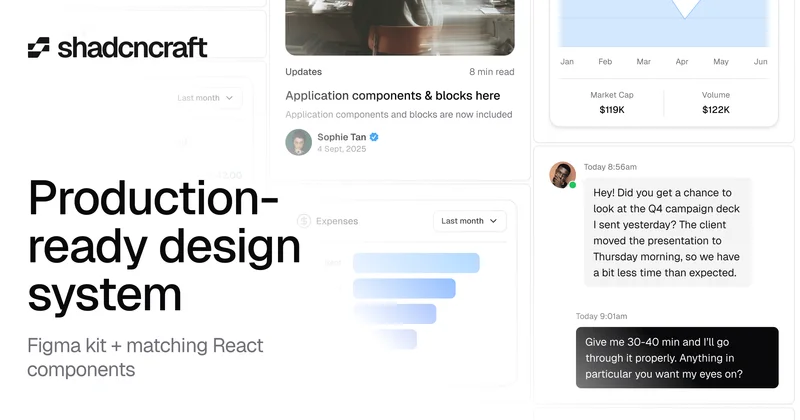
shadcncraft offers a design system with Figma UI kit and React components for efficient app development.
 reui.io
ReUI offers over 1000 free shadcn/ui components for React and Tailwind CSS, enhancing development efficiency and design consistency.
 ui.eindev.ir
Ein UI is an open-source liquid glass UI library for React and Next.js, featuring accessible components and customizable designs.
 abui.io
ABUI offers a collection of reusable UI components for React and Tailwind CSS, enhancing web application development.

HeroUI is a customizable React UI library focused on accessibility and performance, built on Tailwind CSS.
 ui.unlumen.com
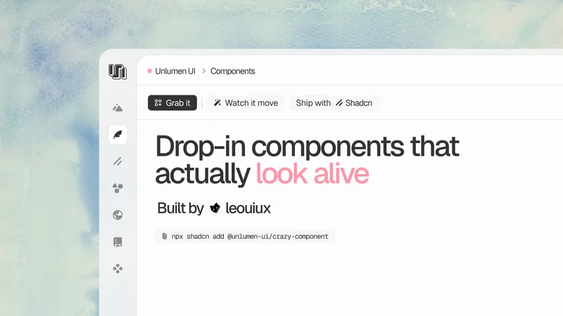
Explore unlumen UI for curated React components that enhance web development with TypeScript and Tailwind CSS.
 mui.com
Material UI is an open-source React library for implementing Material Design, offering customizable and production-ready components.