prism/react
 dsikeres1.github.io
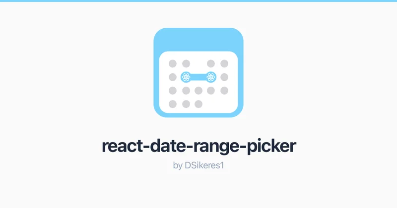
A headless, composable date & range picker for React
 ui.doras.to
Discover Doras UI - A modern, accessible component library for React. Copy, paste, and customize beautiful UI blocks for your next project. Built with TypeScript and Tailwind CSS.
 diceui.com
Accessible shadcn/ui components built with React, TypeScript, and Tailwind CSS. Copy-paste ready, and customizable.
 cult-ui.com
Open-source Shadcn UI components, animated blocks, and full templates you can copy-paste into any TypeScript/Next.js project.
 creative-tim.com
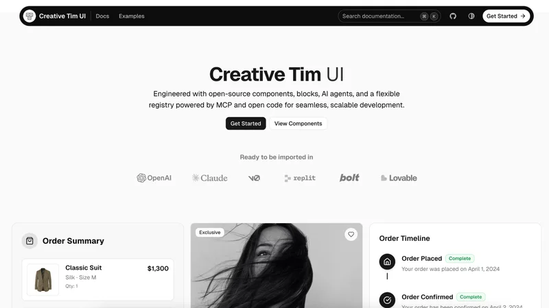
A collection of open-source UI Components, Blocks & AI Agents by Creative Tim on top of shadcn/ui. Integrate them in v0, Lovable, Claude, or your application.
 commercn.com
Shadcn UI blocks for e-commerce websites. Built with React, Next.js, and Tailwind CSS.
 clerk.com
Use the shadcn/ui CLI to bootstrap your Next.js app with Clerk.
 cardcn.dev
Explore a collection of awesome Shadcn Card components built with React and Tailwind CSS.
 animate-ui.com
Fully animated, open-source component distribution built with React, TypeScript, Tailwind CSS, Motion and Shadcn CLI. Browse a list of components you can install, modify, and use in your projects.
 ui.aevr.space
A collection of beautiful, accessible, and production-ready components built on top of shadcn/ui. Get started in seconds.