prism/react-components
 github.com
Calendly integration for React apps. Contribute to tcampb/react-calendly development by creating an account on GitHub.
 flowkit-ui.vzkiss.com
Patterns teams rebuild on every project - built once, reusable everywhere. Each one targets a concrete problem. Built on shadcn/ui and Base UI.
 odysseyui.com
A design focused component library for Next.js, built for speed, flexibility and developer experience .
 sabraman.ru
Reusable legacy and skeuomorphic React components with docs, install commands, and previews for Next.js and shadcn/ui projects.
 tailgrids.com
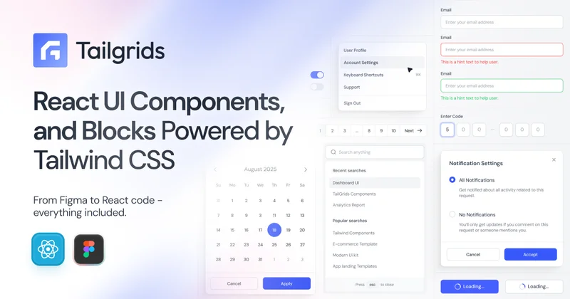
Tailgrids UI is an open-source React component library built with Tailwind CSS. Build production-ready apps faster with reusable components, UI blocks, templates, CLI tooling, theming, and a Figma design system.
 componentry.fun
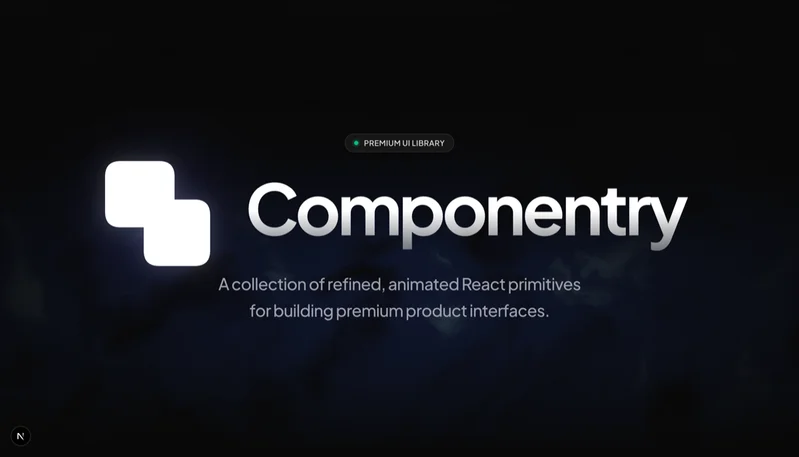
Free, open-source React UI components. Beautiful, animated, copy-paste components built with Tailwind CSS, TypeScript & Framer Motion by Harsh Jadhav.
 pixelactui.com
A modern pixel art styled React component library built on shadcn/ui. Open source, customizable, and perfect for retro-themed applications.
 sona-ui.vercel.app
A modern UI component library built with React and TailwindCSS to help you build beautiful and accessible web applications faster.
 typedora-ui.netlify.app
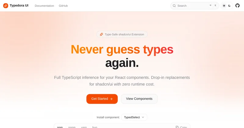
Type-safe React components with full TypeScript inference. Drop-in replacements for shadcn/ui with zero runtime cost.
 jolyui.dev
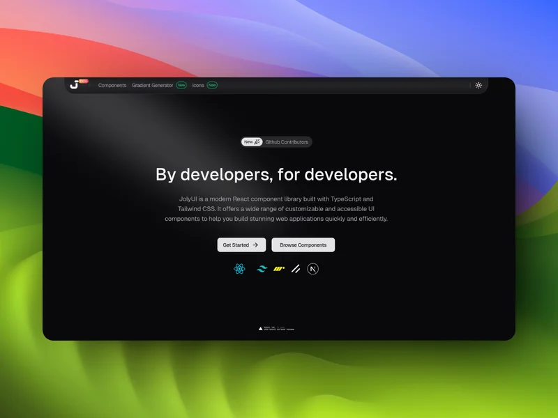
Joly UI is an open-source library of 50+ beautifully crafted React components extending shadcn/ui. Build stunning interfaces faster with accessible, fully typed components. Just copy, paste, and customize. Works seamlessly with Next.js 14+, React 19, TypeScript, and Tailwind CSS v4.